10 Essentials to Boost Conversions on Your Rental Website
Written by: Marcelo Flores
Your website, if done right, is your best salesperson. A good-looking site isn’t enough. You need a site that guides visitors to action, answers key questions, and builds trust. In this post, we’ll show you exactly what your party rental website needs to turn visitors into leads.
👉 Download Now our FREE EBOOK on How to Grow Your Event Rental from $0 to $100k!
Table of contents
- 1. Design and Navigation
- 2. Categories and Subcategories
- 3. Clear CTAs That Drive Action
- 4. Service Area and Delivery Info (Don’t Hide It!)
- 5. Packages and Pricing That Build Trust
- 6. High-Quality Photos That Sell for You
- 7. Social Proof: Reviews, Testimonials
- 8. Mobile Optimization Isn’t Optional
- 9. Fast Loading Speed = More Inquiries
- 10. Contact Forms That Actually Work
1. Design and Navigation
Your website is like your store, and your home page is like your front store. People judge a store in just a few seconds and decide whether to enter or not. With websites the same happens, people judge a website and decide to keep navigating or not in less than 5 seconds.

For this reason it’s essential for you to keep your homepage clean and clear. Avoid clutter, unnecessary animations, or confusing layouts. Your homepage should instantly communicate who you are, what you rent, and how someone can get started.
2. Categories and Subcategories
The structure of your website menu depends on how large your inventory is. But no matter the size, always think like your customer: What would you expect to see if you were renting party supplies?
Keep the menu clear. Use main categories when your inventory is small, and add subcategories as your catalog grows. For example:
Main categories:
- Chairs
- Tables
- Linens
- Tents…
Subcategories under “Chairs”:
- Chiavari chairs
- Folding chairs
- Stacking chairs
- Lounge chairs…
By organizing your store this way, you make it easier for prospects to find what they need in just a few clicks, and you’ll also improve your SEO by targeting specific keywords on each page.
3. Clear CTAs That Drive Action
A beautiful website means nothing if it doesn’t move visitors to take action. That’s where your Call-To-Actions (CTAs) come in.
Your CTA must be:
- Visible: Place them above the fold and repeat them throughout key sections.
- Clear: Use simple language like “Request a Quote,” “Check Availability,” or “Call Now.”
- Consistent: Stick to one main CTA per screen. Don’t overwhelm users with too many choices.
The easier it is for visitors to take action, the more leads you’ll convert.
4. Service Area and Delivery Info (Don’t Hide It!)
One of the biggest reasons visitors bounce is uncertainty. If people don’t know where you deliver or whether you serve their area, they’ll leave.
Think of all the information that a customer needs to take action: service area, delivery info, payment options, minimum order quantities and any other details you find important to mention, and make it visible.
Don’t bury this information in your FAQ. Add it to your homepage, footer, and key product or category pages. Clarity builds trust, and most people won’t reach out to ask. They’ll simply go with the competitor who made it easier.
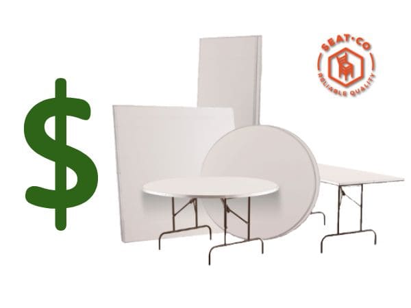
5. Packages and Pricing That Build Trust
Just like your service area and delivery info, pricing should be visible and easy to understand. Showing your packages and providing some pricing details builds trust and filters out non-qualified leads.
Many businesses fear that showing their prices will scare away potential customers, but we’ve seen the opposite. Party rentals that start showing pricing usually see fewer inquiries from unqualified leads (who were never going to book anyway) and more inquiries from serious prospects who now have enough information to take the next step.
Show pricing for each product when possible, and also consider offering bundles or curated packages at different tiers. For example:
- Basic package: chairs and tables
- Middle package: chairs, tables, linens and a tent (best choice)
- Premium package: chairs, tables, linens, tent, tableware and glassware.
Bundles not only make the buying process easier, they also increase your average order value. Just make sure each package clearly lists what it includes to avoid confusion and build confidence.
6. High-Quality Photos That Sell for You
In the events industry, visuals are what sell. Your customers are planning something memorable, they want to see exactly what they’re getting.
Alongside your standard product photos (usually on a white background), include images of your items in use. Show the chairs at a wedding ceremony and the tables set up for a dinner. This not only builds trust but also triggers an emotional response that helps move the customer closer to booking.
You don’t need to be a professional photographer. What your customers care about most is authenticity. If your photos feel real, you’ll stand out and position yourself as their top choice for rentals.
7. Social Proof: Reviews, Testimonials
Buyers trust strangers more than they trust brands. That’s why testimonials are one of the most powerful tools to turn visitors into bookings.

Make sure to include:
- Customer Reviews: Add star ratings or written reviews to your product pages. Include full names and event types when possible.
- Testimonials: A separate section with highlighted quotes from happy clients, ideally with photos or logos from their events.
- User-Generated Content: Share photos from real clients using your rentals. It shows the quality of your items in real settings.
Actively search for reviews. People are more likely to leave bad reviews on their own than good ones. But if you have happy customers, don’t be afraid to ask. Ask for reviews via email or message, and if you can get video reviews, even better. Videos from real clients are one of the most powerful trust-builders you can share.
8. Mobile Optimization Isn’t Optional
More than half of your visitors will be browsing your site from their phones. If your website isn’t mobile-friendly, you’ll be losing many leads.
If you create your site in Shopify, mobile optimization is easy thanks to its built-in responsive themes.
- Responsive Design: Your site should adapt smoothly to any screen size, especially for browsing your products and filling out your forms.
- Clickable CTAs: Make sure buttons like “Request a Quote” or “Call Now” are easy to tap on mobile.
- Fast Loading on Mobile: Mobile users are even less patient than desktop users. Compress images and avoid heavy scripts that slow things down.
Google also prioritizes mobile-friendly websites in search rankings, so optimizing for mobile doesn’t just help with conversions, it helps with visibility too.
9. Fast Loading Speed = More Inquiries
Speed matters a lot. If your site takes more than a couple of seconds to load, many visitors will leave before they even see your products.
Here’s how to keep it fast:
- Compress Images: Use tools like TinyPNG or WebP formats to reduce file sizes without losing quality.
- Limit Plugins and Scripts: Too many third-party apps or features can slow things down. Keep only what’s essential.
- Use Fast Hosting: Choose a reliable hosting provider or platform like Shopify that prioritizes performance.
A fast site improves your SEO rankings, reduces bounce rates, and most importantly, leads to more quote requests.
10. Contact Forms That Actually Work
Your contact form is one of the most important parts of your website, so pay attention to it. If it’s confusing, too long, or doesn’t work properly, you’re losing leads. Here’s what to focus on:
- Keep It Simple: Only ask for the essentials: name, event date, email, phone, and services needed. The more fields you add, the fewer people will complete it.
- Make It Mobile-Friendly: Your form should be easy to fill out on a phone, with large fields and clear buttons.
- Test It Often: You’d be surprised how many forms break without anyone noticing. Test your form regularly to ensure it submits correctly and that you receive the lead notifications.
Bonus tip: Add a confirmation message or thank-you page. It reassures users their message went through, and it’s a great place to set expectations on when they’ll hear back from you.
Every detail on your website matters—from how fast it loads to how easy it is to find your contact form. When your site is clear, mobile-friendly, and built with your customer in mind, it doesn’t just look good, it converts. Start with these essentials, and you’ll see better leads and more bookings.
When your website is ready you’ll be ready to send traffic from your Google Ads campaigns or from your Facebook or Instagram ads and actually convert those clicks into bookings.